Tag: android / Back
Mobile UI Design is hard - TabSplit Participant Select
2011-07-27 19:55:37
Sometimes it's really hard to decide on a UI for a mobile application. Even if you have a couple of possibilities which seem useful it's just hard to know what could work best.. I'm currently deciding on a UI for \TabSplit.
So imagine you want to add participants to a tab on TabSplit. What would be the best option? I have three examples:
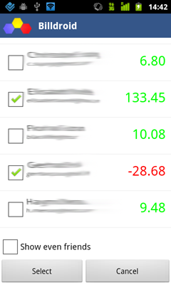
Checkboxes
This is pretty simple - You take the usual contact list and add checkboxes. Once you are done selecting all participants you click 'Select'. I could also simply add a way to filter in that list or sort differently, etc. It would look something like this:

What's wrong with this? Well.. it's not that easy to see which contacts are already selected, you have to scroll through the whole list - imagine if you have 50 contacts, there is no way to quickly see who is currently selected. This gets even worse when you apply filtering.. Those contacts which are selected but don't match your filter are simply not displayed and you obviously don't see them.. Which is probably a usability nightmare?
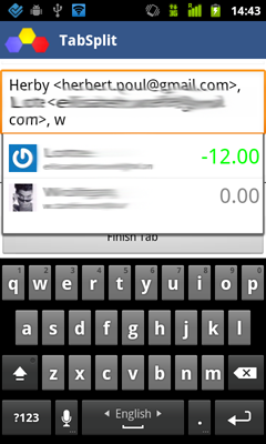
Multi Auto Select
This would work similar to the email application. You edit the participants directly in the Tab, but get a auto select which looks pretty much the same as the contact list.

This actually works pretty well. You see who participates quite easily (although not really nice) and you can add new participants by simply typing a substring of their name and then clicking on it. But it's quite hard to remove contacts, and you always have to start typing before you see suggestions, which is not really smooth..
Contact List with a top bar of selections
The last thing i came up with was to modify the contact list that you would simply select a single contact which gets added to a "stack" on the top of the page so you can see who is selected.. this stack can scroll horizontally and might display the name of the "active" avatar.

i think this is a nice solution, but i'm not sure if it's really easy to understand by all users.. and the avatars have to be quite big so users can recognize them which uses quite a bit of screen space.
What do you think?
I have actually no idea which one i like most.. currently i think the last one makes the most sense to me, and looks quite cool (although i think i'll have to make the horizontal list of avatars aligned left). The only problem is that i have to ensure that users add avatars, otherwise this screen wouldn't make sense at all.
Do you have more ideas? which one do you like most? i appreciate any kind of feedback.
So imagine you want to add participants to a tab on TabSplit. What would be the best option? I have three examples:
Checkboxes
This is pretty simple - You take the usual contact list and add checkboxes. Once you are done selecting all participants you click 'Select'. I could also simply add a way to filter in that list or sort differently, etc. It would look something like this:

What's wrong with this? Well.. it's not that easy to see which contacts are already selected, you have to scroll through the whole list - imagine if you have 50 contacts, there is no way to quickly see who is currently selected. This gets even worse when you apply filtering.. Those contacts which are selected but don't match your filter are simply not displayed and you obviously don't see them.. Which is probably a usability nightmare?
Multi Auto Select
This would work similar to the email application. You edit the participants directly in the Tab, but get a auto select which looks pretty much the same as the contact list.

This actually works pretty well. You see who participates quite easily (although not really nice) and you can add new participants by simply typing a substring of their name and then clicking on it. But it's quite hard to remove contacts, and you always have to start typing before you see suggestions, which is not really smooth..
Contact List with a top bar of selections
The last thing i came up with was to modify the contact list that you would simply select a single contact which gets added to a "stack" on the top of the page so you can see who is selected.. this stack can scroll horizontally and might display the name of the "active" avatar.

i think this is a nice solution, but i'm not sure if it's really easy to understand by all users.. and the avatars have to be quite big so users can recognize them which uses quite a bit of screen space.
What do you think?
I have actually no idea which one i like most.. currently i think the last one makes the most sense to me, and looks quite cool (although i think i'll have to make the horizontal list of avatars aligned left). The only problem is that i have to ensure that users add avatars, otherwise this screen wouldn't make sense at all.
Do you have more ideas? which one do you like most? i appreciate any kind of feedback.
Hey, we have Signatures !!! Great, isn't it ? ;)
Posted by Herbert Poul
0 CommentsPage 1
Archive
- December, 2009 1 posts.
- December, 2008 2 posts.
- November, 2009 1 posts.
- November, 2008 1 posts.
- October, 2010 1 posts.
- September, 2008 2 posts.
- August, 2018 2 posts.
- August, 2008 2 posts.
- July, 2018 1 posts.
- July, 2011 2 posts.
- July, 2010 1 posts.
- July, 2009 1 posts.
- July, 2008 1 posts.
- June, 2010 1 posts.
- June, 2009 1 posts.
- May, 2011 1 posts.
- May, 2009 1 posts.
- April, 2011 1 posts.
- April, 2008 1 posts.
- March, 2010 1 posts.
- March, 2009 1 posts.
- February, 2013 1 posts.
- February, 2010 1 posts.
- February, 2009 5 posts.
- February, 2008 3 posts.
- January, 2011 1 posts.
- January, 2010 1 posts.
- January, 2009 4 posts.
- January, 2008 2 posts.


